A font stack can be obtained from system_fonts() using one of various
keywords such as "system-ui", "old-style", and "humanist" (there are 15
in total) representing a themed set of fonts. These sets comprise a font
family that has been tested to work across a wide range of computer systems.
This is useful when specifying font values in cell_text()
(itself used inside tab_style()). If using opt_table_font(), we can
invoke this function in its stack argument.
Arguments
- name
Name of font stack
scalar<character>// requiredThe name of a font stack. Must be drawn from the set of
"system-ui","transitional","old-style","humanist","geometric-humanist","classical-humanist","neo-grotesque","monospace-slab-serif","monospace-code","industrial","rounded-sans","slab-serif","antique","didone", and"handwritten".
The font stacks and the individual fonts used by platform
System UI ("system-ui")
The operating system interface's default typefaces are known as system UI fonts. They contain a variety of font weights, are quite readable at small sizes, and are perfect for UI elements. These typefaces serve as a great starting point for text in data tables and so this font stack is the default for gt.
Transitional ("transitional")
The Enlightenment saw the development of transitional typefaces, which combine Old Style and Modern typefaces. Times New Roman, a transitional typeface created for the Times of London newspaper, is among the most well-known instances of this style.
Old Style ("old-style")
Old style typefaces were created during the Renaissance and are distinguished by diagonal stress, a lack of contrast between thick and thin strokes, and rounded serifs. Garamond is among the most well-known instances of an antique typeface.
Humanist ("humanist")
font-family: Seravek, 'Gill Sans Nova', Ubuntu, Calibri, 'DejaVu Sans', source-sans-pro, sans-serif;Low contrast between thick and thin strokes and organic, calligraphic forms are traits of humanist typefaces. These typefaces, which draw their inspiration from Renaissance calligraphy, are frequently regarded as being more readable and easier to read than other sans serif typefaces.
Geometric Humanist ("geometric-humanist")
Clean, geometric forms and consistent stroke widths are characteristics of geometric humanist typefaces. These typefaces, which are frequently used for headlines and other display purposes, are frequently thought to be contemporary and slick in appearance. A well-known example of this classification is Futura.
Classical Humanist ("classical-humanist")
The way the strokes gradually widen as they approach the stroke terminals without ending in a serif is what distinguishes classical humanist typefaces. The stone carving on Renaissance-era tombstones and classical Roman capitals served as inspiration for these typefaces.
Neo-Grotesque ("neo-grotesque")
Neo-grotesque typefaces are a form of sans serif that originated in the late 19th and early 20th centuries. They are distinguished by their crisp, geometric shapes and regular stroke widths. Helvetica is among the most well-known examples of a Neo-grotesque typeface.
Monospace Slab Serif ("monospace-slab-serif")
Monospace slab serif typefaces are distinguished by their fixed-width letters, which are the same width irrespective of their shape, and their straightforward, geometric forms. For reports, tabular work, and technical documentation, this technique is used to simulate typewriter output.
Monospace Code ("monospace-code")
font-family: ui-monospace, 'Cascadia Code', 'Source Code Pro', Menlo, Consolas, 'DejaVu Sans Mono', monospace;Specifically created for use in programming and other technical applications, monospace code typefaces are used in these fields. These typefaces are distinguished by their clear, readable forms and monospaced design, which ensures that all letters and characters are the same width.
Industrial ("industrial")
font-family: Bahnschrift, 'DIN Alternate', 'Franklin Gothic Medium', 'Nimbus Sans Narrow', sans-serif-condensed, sans-serif;The development of industrial typefaces began in the late 19th century and was greatly influenced by the industrial and technological advancements of the time. Industrial typefaces are distinguished by their strong sans serif letterforms, straightforward appearance, and use of geometric shapes and straight lines.
Rounded Sans ("rounded-sans")
font-family: ui-rounded, 'Hiragino Maru Gothic ProN', Quicksand, Comfortaa, Manjari, 'Arial Rounded MT', 'Arial Rounded MT Bold', Calibri, source-sans-pro, sans-serif;The rounded, curved letterforms that define rounded typefaces give them a softer, friendlier appearance. The typeface's rounded edges give it a more natural and playful feel, making it appropriate for use in casual or kid-friendly designs. Since the 1950s, the rounded sans-serif design has gained popularity and is still frequently used in branding, graphic design, and other fields.
Slab Serif ("slab-serif")
Slab Serif typefaces are distinguished by the thick, block-like serifs that appear at the ends of each letterform. Typically, these serifs are unbracketed, which means that they do not have any curved or tapered transitions to the letter's main stroke.
Antique ("antique")
font-family: Superclarendon, 'Bookman Old Style', 'URW Bookman', 'URW Bookman L', 'Georgia Pro', Georgia, serif;Serif typefaces that were popular in the 19th century include antique typefaces, also referred to as Egyptians. They are distinguished by their thick, uniform stroke weight and block-like serifs.
Didone ("didone")
Didone typefaces, also referred to as Modern typefaces, are distinguished by their vertical stress, sharp contrast between thick and thin strokes, and hairline serifs without bracketing. The Didone style first appeared in the late 18th century and became well-known in the early 19th century.
Examples
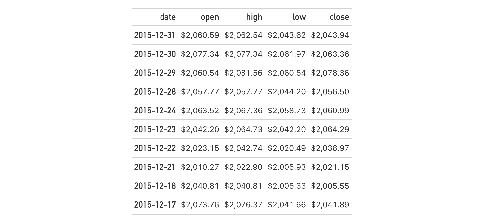
Use a subset of the sp500 dataset to create a gt table with 10 rows.
For the date column and the column labels, let's use a different font stack
(the "industrial" one). The system fonts used in this particular stack are
"Bahnschrift", "DIN Alternate", "Franklin Gothic Medium", and
"Nimbus Sans Narrow" (the generic "sans-serif-condensed" and "sans-serif"
are used if the aforementioned fonts aren't available).
sp500 |>
  dplyr::slice(1:10) |>
  dplyr::select(-volume, -adj_close) |>
  gt() |>
  fmt_currency() |>
  tab_style(
    style = cell_text(
      font = system_fonts(name = "industrial"),
      size = px(18)
    ),
    locations = list(
      cells_body(columns = date),
      cells_column_labels()
    )
  )
See also
Other helper functions:
adjust_luminance(),
cell_borders(),
cell_fill(),
cell_text(),
currency(),
default_fonts(),
escape_latex(),
from_column(),
google_font(),
gt_latex_dependencies(),
html(),
latex(),
md(),
nanoplot_options(),
pct(),
px(),
random_id(),
row_group(),
stub(),
unit_conversion()